Project Duration
8 months (2024)
Services Provided
User Experience Design, Research, User Interface Design, Interaction design, Prototype
Background/Overview
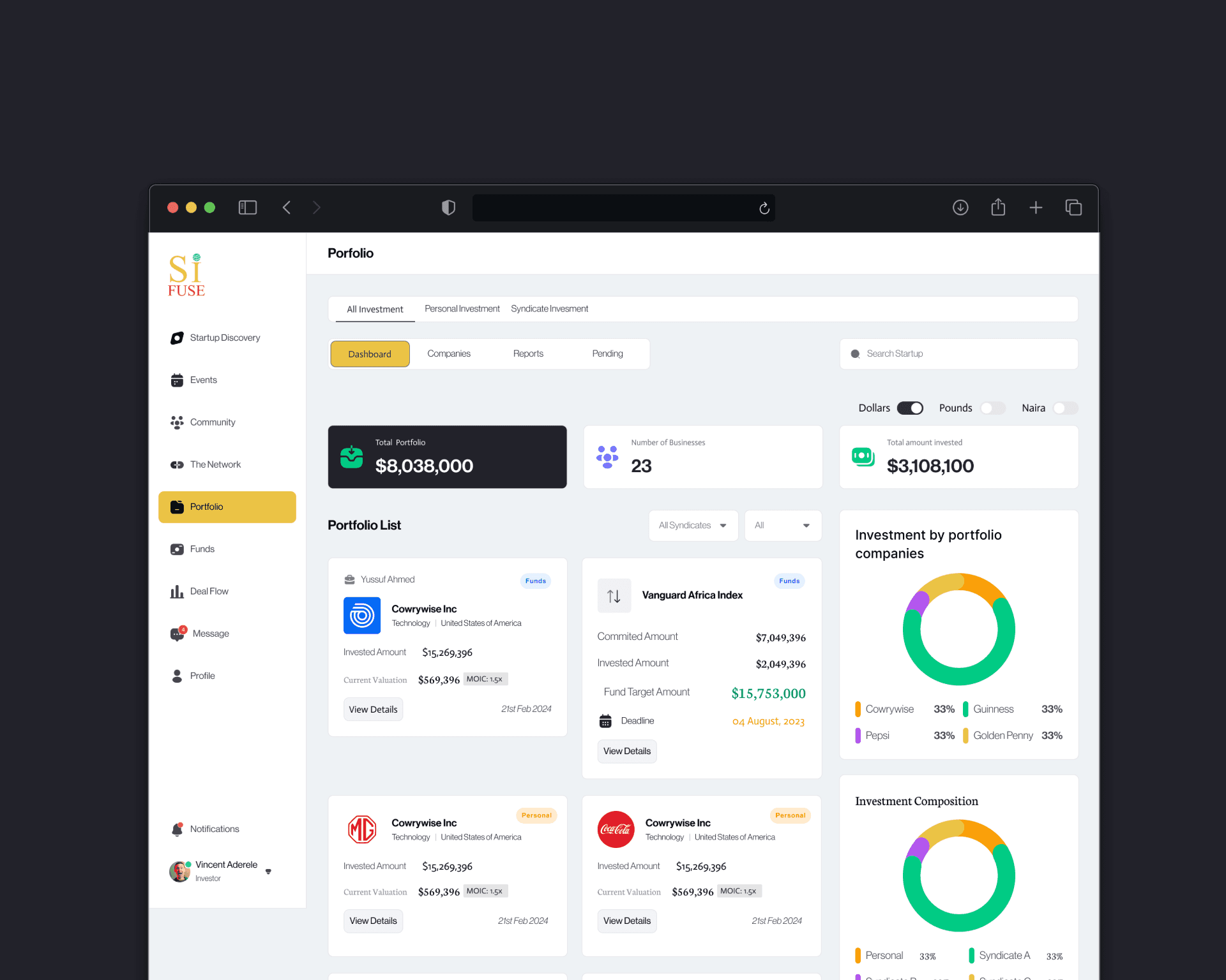
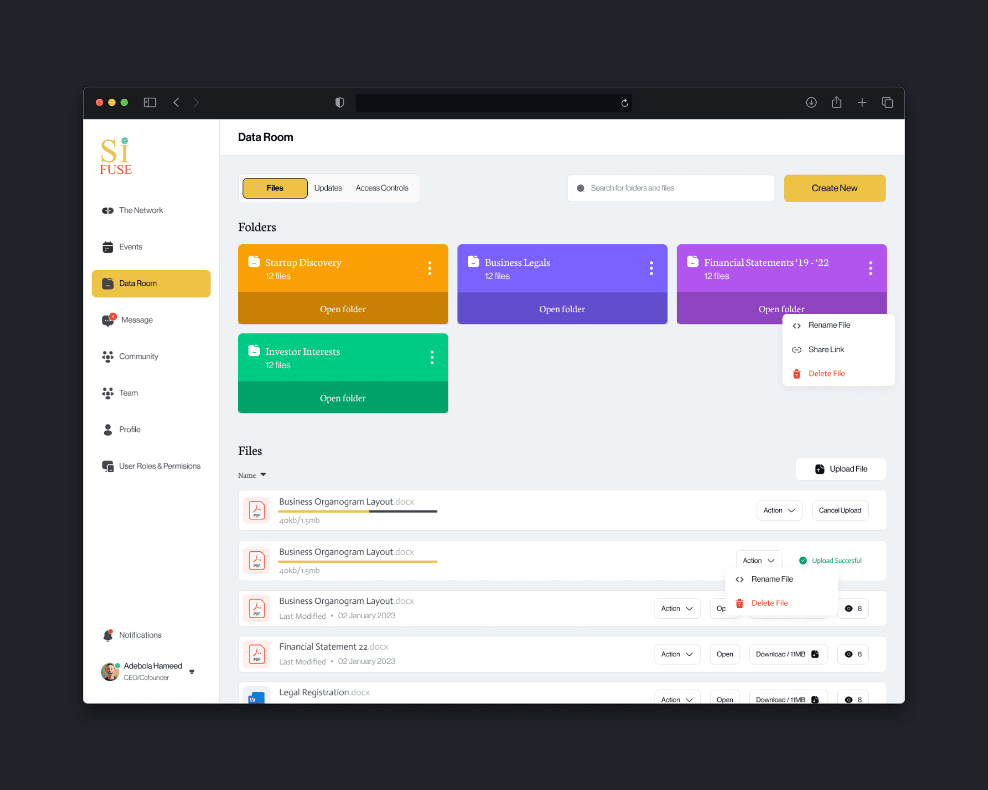
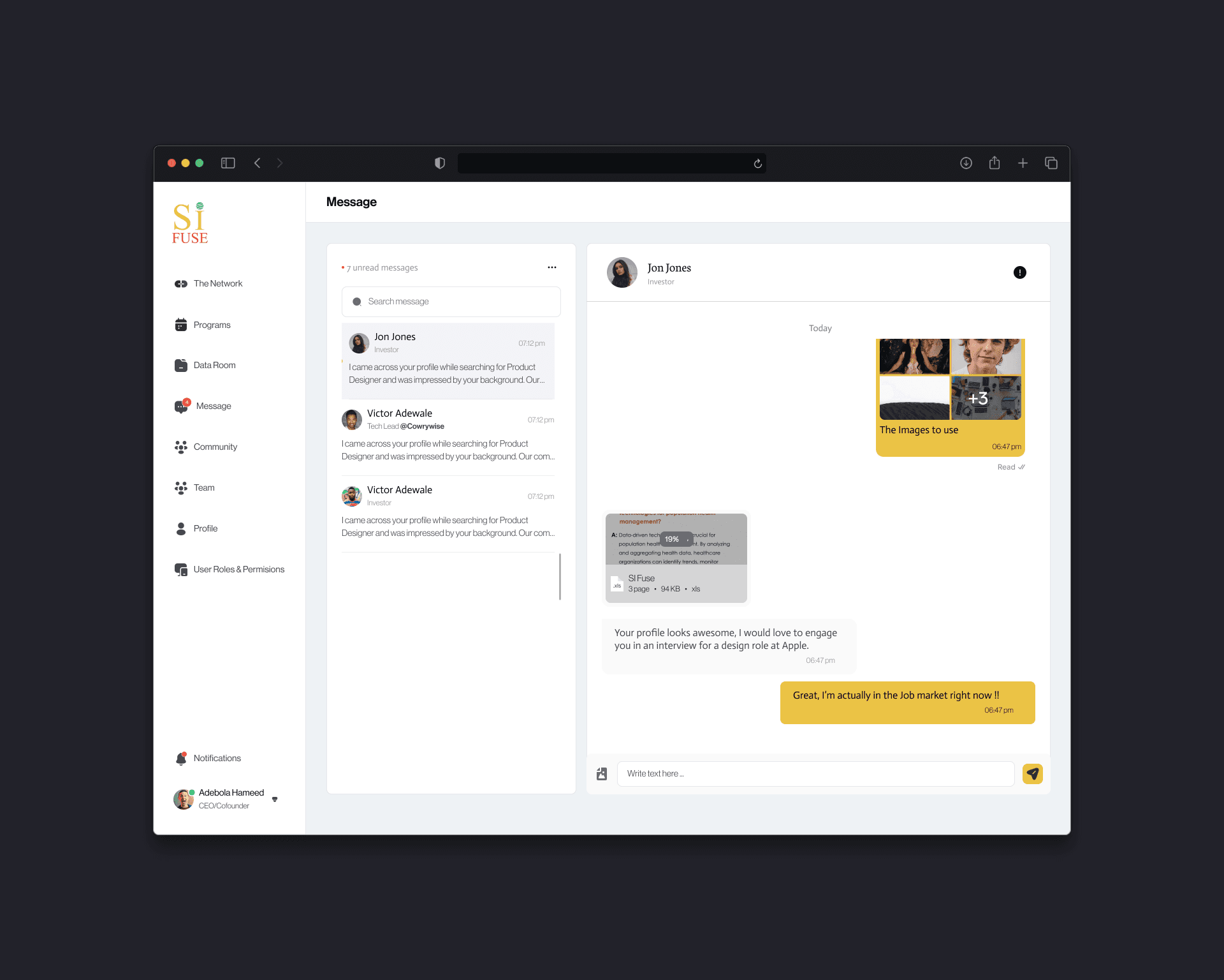
In 2024, I led the end-to-end design of SiFuse, a platform that standardizes how startups communicate progress and how investors evaluate it. The problem space was dominated by scattered spreadsheets, pitch decks, and email updates - making diligence slow, comparisons inconsistent, and “commitments” ambiguous. Our goal was a centralized, founder-friendly system that (1) structures traction signals, (2) clarifies capital pipeline status, and (3) gives investors a trustworthy, comparable view across companies and cohorts.
Understanding the Problem Space
To ground the solution, I combined founder and investor interviews, workflow observation, and competitive analysis.
Here’s what stood out:
Founders spent disproportionate time crafting bespoke updates and answering repeat questions; data drifted across tools, causing mismatched numbers over time.
Investors lacked a standard lens to compare startups; “traction” often mixed vanity metrics with signals that weren’t decision-useful.
Commitment tracking was opaque: verbal interest, soft commits, and signed terms were frequently conflated, delaying closes and eroding trust.
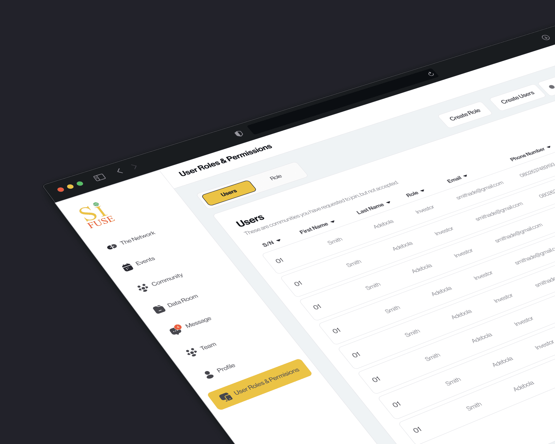
Both sides wanted auditability (who saw what, when), lightweight templates, and clear runway/round progress without exposing sensitive details by default.
These insights shaped a platform focused on structured updates, progressive disclosure, and a verifiable capital pipeline.
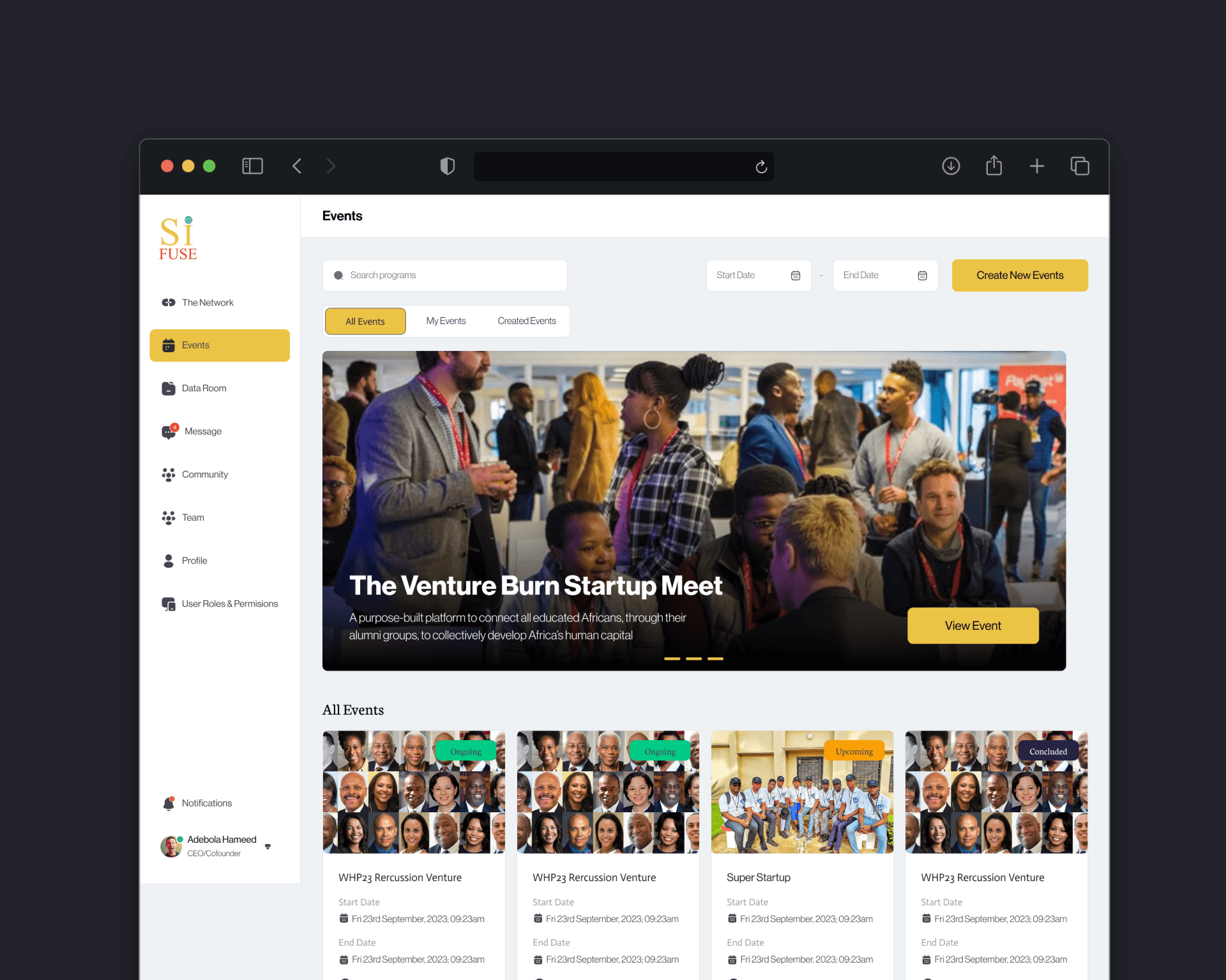
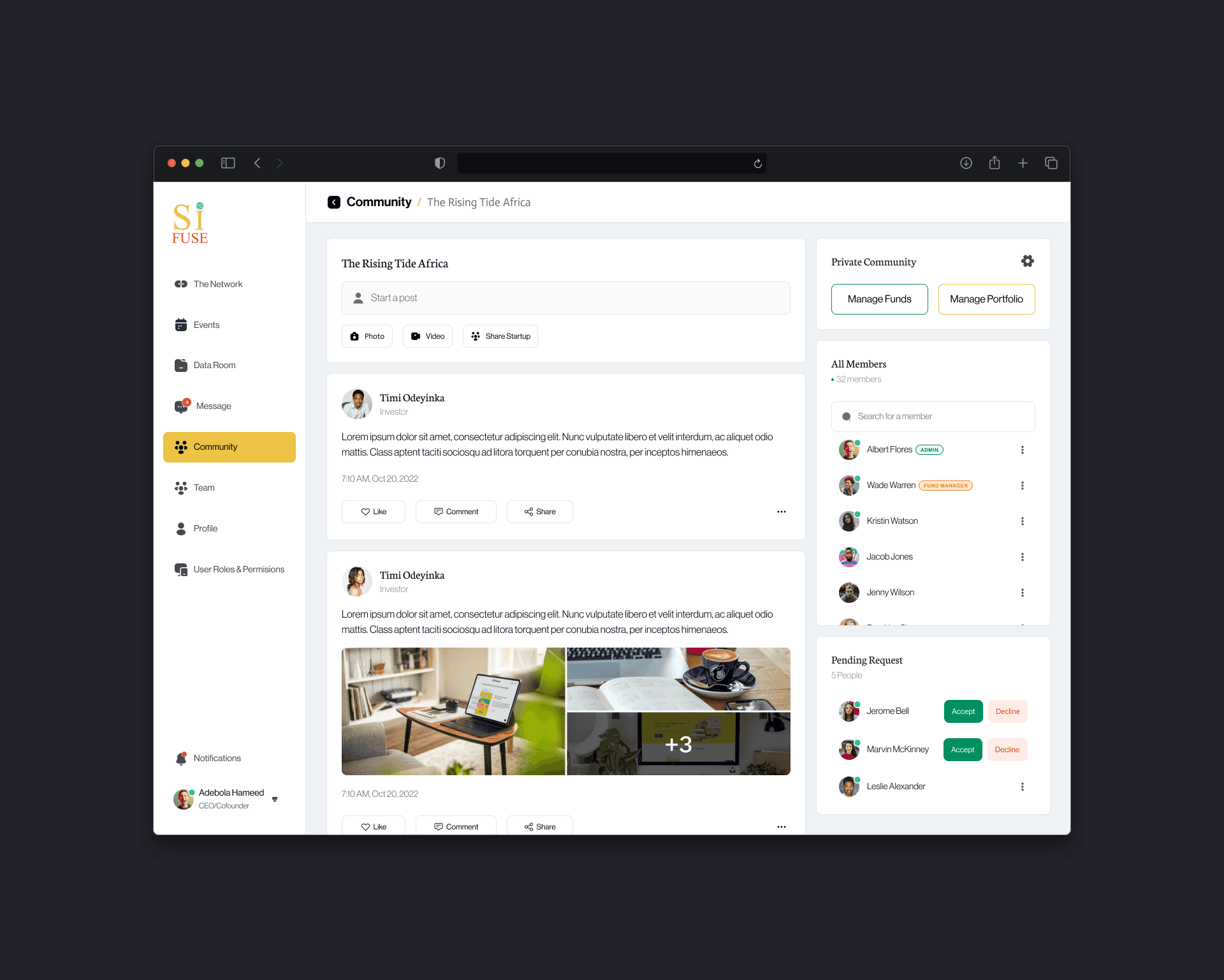
Target Audience
Primary users were early- to growth-stage founders and their prospective investors (angels, syndicates, VC associates/partners). Secondary users included portfolio ops/analysts and accelerator program managers who needed cross-company insights, benchmarking, and standardized reporting.